Here is a (fairly) simple way to create your own custom distressed type in Photoshop. This tutorial assumes an intermediate level of experience with Photoshop. This tutorial was created in version CS2 on a Mac.
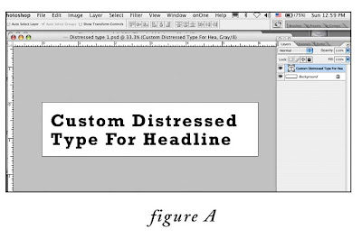
1. Create a new, blank, 300 ppi grayscale document in Photoshop that comfortably fits your headline. Choose a font that has some weight to it, since we will be degrading it. In this example I have created a document 6”wide x 1.5”high, and with the type tool, typed the words “Custom Distressed Type For Headline”in 35pt Rockwell Bold (fig. A).
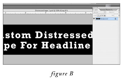
2. Flatten the file (layer menu>flatten image).
3. Invert the image (image menu>adjustments>invert) (fig. B)
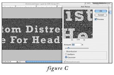
4. Apply the Noise filter: go to Filter menu > Noise > Add Noise…, set the amount to 60%, the distribution to Gaussian. (fig.C)
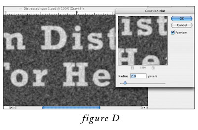
5. Next, apply the Gaussian Blur filter: go to Filter menu > Blur > Gaussian Blur…, set the radius to 2.0 pixels. (fig. D)
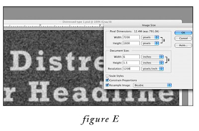
6. At this point, we need to upsample (increase the resolution by interpolation) the image to 1200 ppi. This is because we are eventually going to the convert the image to line art (just black and white, no levels of gray), and line art requires a higher resolution than grayscale to avoid the “jaggies”. So, go to Image menu > Image Size, MAKE SURE the “resample” and “constrain proportion” checkboxes at the bottom are BOTH checked, and in the document size box, change resolution from 300 to 1200 pixels/inch. (fig. E) Click okay.
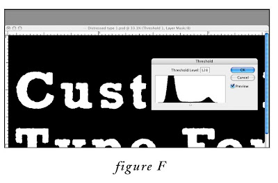
7. Next, we need to add a “Threshold” adjustment layer. Go to Layer menu > New Adjustment Layer > Threshold. In the first dialog box, labeled “New Layer” leave the default settings, click okay. In the second “Threshold”dialog box (fig.F), leave the slider set to the default “128”for now, click okay. As you can see, the threshold adjustment layer converts every pixel in the image to either black or white, depending on where the slider is set. We’ll come back to this in a minute to adjust this setting.
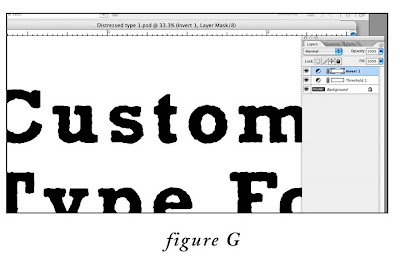
8. Almost done. Now, click on the Threshold adjustment layer you just created in the layers palette to make sure that it is the active layer. Then, add an “Invert” adjustment layer ON TOP of the “Threshold” adjustment layer, by going to Layer menu > New Adjustment Layer > Invert (in the dialog box labeled “New Layer”, leave the default settings, then click okay). This converts the type back to black on white. (fig. G)
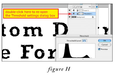
9. Here is the fun part. To customize the amount of “distress”, in the Layers Palette, double click on the Threshold Adjustment layer icon (circle divided diagonally in half) to call up the Threshold dialog box. Experiment with moving the slider gradually to the right to increase the level of distress (fig. H). That’s it! If you want to tweak things further, try experimenting with the Gaussian Blur and Noise settings in steps 4 and 5. Impress your friends, and have fun.

 The second sketch shows a silhouette of Colton on a weathered wood background. In the story, an old license plate with bullet holes and a bronco-buster is one of Colton’s prized possessions. This is my favorite.


