Monday, December 24, 2007

Recent Work: “No Pretty Pictures” Book Jacket


This must be the month for holocaust book covers.
No Pretty Pictures is the powerful wartime memoir of the well-known children's book artist, Anita Lobel. The project art director is Paul Zakris of Greenwillow Books.

Born into a Polish Jewish family in 1934, Lobel, along with her younger brother, spent most of WWII fleeing the Nazis in the Polish countryside before being sent to a concentration camp near the war's end. Miraculously, they were liberated in 1945 and eventually reunited with their parents.

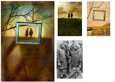
Above is the finished artwork depicting the small "framed" figures of the author and her brother silhouetted on a lonely hillside. At right is the b&w photo (taken shortly after the war) which I used for the figures. To make the photograph of the figures in the landscape, I made a table top model and placed small colorized cutout figures (about 2 or 3 inches high) on the "hill" against a sky backdrop. Much of the detail ended up on the cutting room floor when I digitally added the frame, branches, and painted textures in the finish, but such is life.

My intention is for the weathered, hanging frame to suggest the abandoned possessions of the many victims, as well as to tie in with the title.
Monday, December 17, 2007

Recent Work: “T4” Book Jacket Final Art


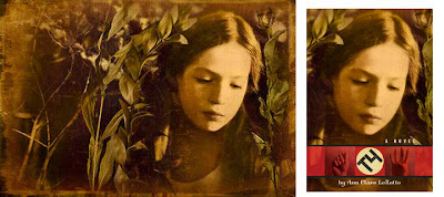
Here is the finished wraparound artwork for the T4 jacket (with many thanks to my striking young model), and how it will appear on the cover with the type treatment (see previous entry) The images of the hands on either side of the "T4" type are sign language for the title. This was the author's idea (nice touch!).

Monday, December 10, 2007

Work In Progress: “T4” Book Jacket


T4, to be published by Houghton Mifflin, is a middle grade holocaust novel in verse by Ann Clare LeZotte.

T4 was the name given the Nazi plan to exterminate Germany’s mentally and physically disabled population. Derived from the address of its headquarters in Berlin, Tiergartenstrasse 4, the policy ended in 1941, but not before 270,000 people had been murdered and another 400,000 sterilized.

The book tells the story of Paula Becker, thirteen year-old German girl. Paula is deaf, and therefore a target of the T4 policy. Fleeing the Nazis, Paula spends two tense years in hiding before being reunited with her family.

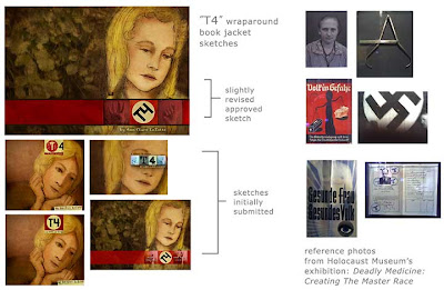
The brief called for a cover that evoked history, without being depressing. Creative Director Sheila Smallwood suggested a subdued but appealing image of Paula. The brevity of the title gave me the opportunity for a type treatment that mimicked the Nazi swastika.

Above are the sketches presented on the left. On the right, are some photos used for reference and inspiration taken with my cell phone at the Maltz Museum of Jewish Heritage exhibition, Deadly Medicine: Creating The Master Race.

Tuesday, December 4, 2007

A Five Step Brainstorming Process

I have been creating conceptual illustrations for about fifteen years, and solving design problems longer than that. To generate ideas, over time I have developed this five step process which has worked well for me:
  1. Immerse yourself in the material. Whether it is a book jacket, magazine illustration, or corporate brochure cover, I take time to really focus on the text. The amount of time will vary, of course, depending on the project. I like to spend enough time so that I can comfortably state the theme of the piece in a couple of sentences.
  2. Free associate. Before I actually start drawing, I spend about twenty minutes making a list. With the content from step one fresh in my mind, I write down any word that comes to mind. These could be visual elements, verbs, or adjectives. Don't edit, just write.
  3. Make many thumbnails. Next, drawing on your free association list, create eight to ten rough thumbnail pencils. Try different combinations of list items. Often for me, adjectives from the list will conjure up visual images. It is important to really push yourself at this point, but still without judging, and don't worry at all about the quality of the drawing. The goal at this stage is quantity. I allow about forty five minutes for this step.
  4. Take a break. Let your unconscious do some of the work, while you do something else. Take a walk, take a shower, I like to play my guitar. This break could be for half an hour, or it could be overnight.
  5. Edit the thumbnails, refine sketches. Okay, this is really two steps, but a five step process sounds so much better than six. Usually, when I come to stage, I have fresh ideas for the thumbnails, so I add to or modify them as needed. Then, I choose the two or three best thumbnail ideas to work up into tighter sketches to present to the client.

Friday, November 23, 2007

Recent Work: How-to Demo for Upcoming Book


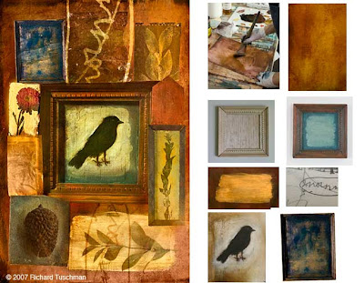
I created the above left image over the last few weeks as a “how-to” demo for Lisa Cyr’s upcoming book, Working On The Cutting-edge: Alternative Approaches in Art and Illustration, to be published by North Light Books. Although the final image is composited and enhanced in Photoshop, the individual elements are created by hand. Some of the pieces were created and/or photographed for this specific piece, such as the central frame and the main background. As part of my usual practice, though, many of the elements are culled from my continuously expanding and evolving library of backgrounds, scraps, and objects. Above right are some of the supporting images for the demonstration, including a photo of me painting the background, the before and after painted balsa wood frame, and scanned sections of some of my older paintings and drawings.

Monday, November 12, 2007

Recent Work: “Wounded Warriors” Illustration


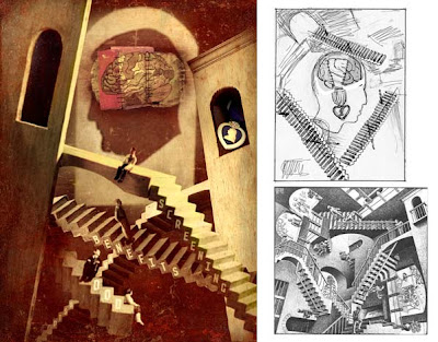
For soldiers fortunate enough to survive severe head injuries in combat, attempting to navigate the disjointed military healthcare system back home can be another daunting challenge. In this illustration for designer Jill Akers at Military Officer Magazine, I tried to suggest the confusing bureacracy by looking to M.C. Escher for inspiration. I had done a couple of other sketches first, and this very rough pencil was almost an afterthought. I was slightly hesitant to present it, because I knew it would be by far the most labor intensive choice (had to build the little stairs, etc.), but I also felt drawn to the challenge. I like the way it turned out, though my wife hates it when I use the little model railroad people. Any opinions?

Thursday, November 8, 2007

From Charles Shulz to Chuck Close


Breaking down a large task into smaller, manageable pieces is a well known productivity tool. Last week, NPR listeners were treated to two stellar examples in the practice of this principle by Peanuts creator, Charles Shulz, and the large scale portrait painter, Chuck Close.

On The Diane Rehm Show, Shulz’ biographer David Michaelis spoke of the acclaimed cartoonist's dogged (no pun intended) work ethic. Inspired by his barber father, who built his business “one haircut at a time”, Shulz realized his lifelong goal of becoming a cartoonist “one strip-a-day”, and built his syndicated empire “one newspaper at a time”.

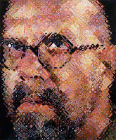
In the rebroadcast of a 1998 interview with Chuck Close by Terry Gross on Fresh Air, the internationally renowned artist acknowledged how his use of a grid helps him sustain his focus while working on very large paintings, each of which takes many months to complete. By completing one small square of the grid each day, Close is able to take pleasure in a sense of accomplishment analagous to creating a single painting every day.

To me, this also underscores the importance of habits. Most often, our most satisfying achievements are simply the sum of many, many small choices.

Sunday, November 4, 2007

Glass Flowers at HMNH


When a friend first told me I absolutely had to see the Glass Flower Collection at the Harvard Museum of Natural History, I thought of tacky glass trinkets one might see at a gift shop. As anyone who has experienced them knows, I could not have been more wrong. Created as botanical teaching models from 1897–1936 by the Bohemian father-son team of Leopold and Rudolph Blaschka, the flowers are one of the most stunning achievements I have ever seen. I felt humbled trying to get my arms around the level of sensitivity, patience, and invention that went into the making of each object. And there are over 3000 of them! Don't judge by these small photos here, or any photos for that matter. You have to see them to believe them. As scientific models, they are touted as jaw-droppingly accurate. As art, they are achingly evocative meditations on the imperfect, fragile beauty of life.

Tuesday, October 30, 2007

Recent Work: “The Shadow Walker” book jacket

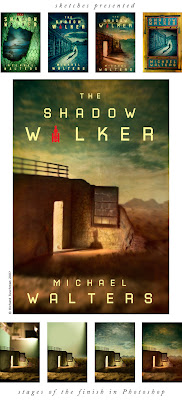
I designed and illustrated this book jacket for art director Rita Frangie at Berkley Books. Set in present day Mongolia, The Shadow Walker, by Michael Walters, spins a tale of corporate espionage and murder. The editors were looking for a “film noir” atmosphere, as suggested by the title. Much of the action in the book alternates between lonely, abandoned Soviet era factories and the stark beauty of the Gobi desert, and I wanted to show both on the cover. Below are the four sketches I presented, the finished artwork, and progressive states of the digital final in Photoshop. Notice the miniature Gobi desert setup on my work table. The red symbol replacing the letter “A” in “Walker” is the emblem featured on the Mongolian flag.


Thursday, October 25, 2007

Recent Work: Cardio Care Illustration

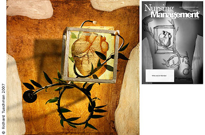
This is the sketch and finish for a recent assignment for Michael Trinsey at Nursing Management Magazine. I originally created the sketch as more generic medical image for the cover (hence the masthead on the sketch). Rejected as a cover, it was later published as an interior illustration accompanying a feature on cardiological care.